Want to use SQL Server Reporting Services (SSRS) to create custom dashboards for yourself, your users and your executives? These dashboards can be deployed within GP itself or in a tool such as Business Analyzer which is available on phones and tablets. Here are some simple tips to guide you in the right direction.
Getting the Data
The first step is to get your data and create your query. Here is a GP table cheat sheet for easy reference.
MODULES
CM = Bank Reconciliation
FA = Fixed Assets
GL = General Ledger
HR = Human Resources
IV = Inventory
PM = Payables Management
POP = Purchase Order Processing
RM – Receivables Management
SOP = Sales Order Processing
SY = System/Company
UPR = Payroll
TABLE NUMBERS
00xxx = Card/Master Record
1xxxx = Work Records
2xxxx = Open Records
3xxxx = History Records
4xxxx/5xxxx = Setup Records
Building the Report
Using Report Builder within the SQL Server Reporting Services Website will easily guide you through a drag and drop wizard to create your charts and graphs. Once the data is there, the next step is formatting. Report Builder formatting works very similarly to the Office products that you’re already familiar with, so the learning curve is almost non-existent.
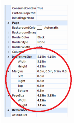
If you are planning to use these charts in the GP home page dashboard, the specific sizing of the chart is very important – use the guideline below to appropriately size them for your homepage.

The Results
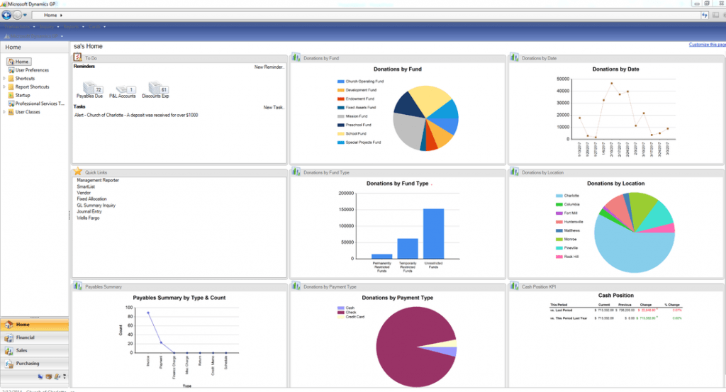
SAMPLE GP HOME PAGE DASHBOARD

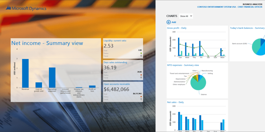
SAMPLE BUSINESS ANALYZER FOR WINDOWS DASHBOARD

If you have any questions or need assistance with creating SSRS reports, feel free to contact us.
